AXL Seguros
UX/UI
Case study
Problem
AXL currently has 8 different applications for each of its different services.
In this way, the experience, especially for customers who have more than one service contracted, becomes a tedious and burdensome task, as users need to download several different applications to manage their insurance and other related services, such as claims or service updates.
Objective
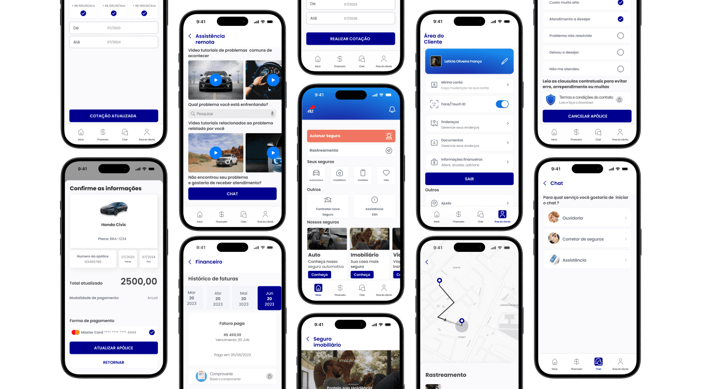
Consolidate the largest number of features that are currently spread across different applications into one application where the user can manage their policies, invoices, emergencies, troubleshooting/questions, and documentation, as well as purchase new services, all in one place.
Problema
A AXL hoje conta com 8 aplicativos diferentes para cada um de seus diferentes serviços.
Desta forma a experiência, especialmente para clientes que tem mais de um serviço contratado se torna uma tarefa ardorosa e maçante, vide que os usuários precisam baixar vários aplicativos diferentes para gerenciar os seus seguros e outros serviços relacionados, como reclamações ou atualizações dos serviços
Objetivo
Consolidar a maior quantidade de funcionalidades que hoje estão espalhadas por aplicativos diferentes em um aplicativo onde o usuário poderá gerênciar suas apólices, faturas, emergências, resolução de problemas/dúvidas e documentação, além de contratar novos serviços, tudo em um só lugar
Kick off
To begin, I started to familiarize myself better with the subject and the market that AXL is part of. I looked for points such as: Audience, Age groups, the most recent growth data, and the main problems that users face.
A large part of the Brazilian population does not have any kind of insurance.
The market has been growing since the Covid-19 pandemic due to uncertainties.
The most sought-after types of insurance in Brazil were: Life, Auto, Funeral, Real Estate, and Travel.
An increasingly competitive market with national and foreign insurers
Structuring Insights and Competitor Analysis for Strategic Alignment
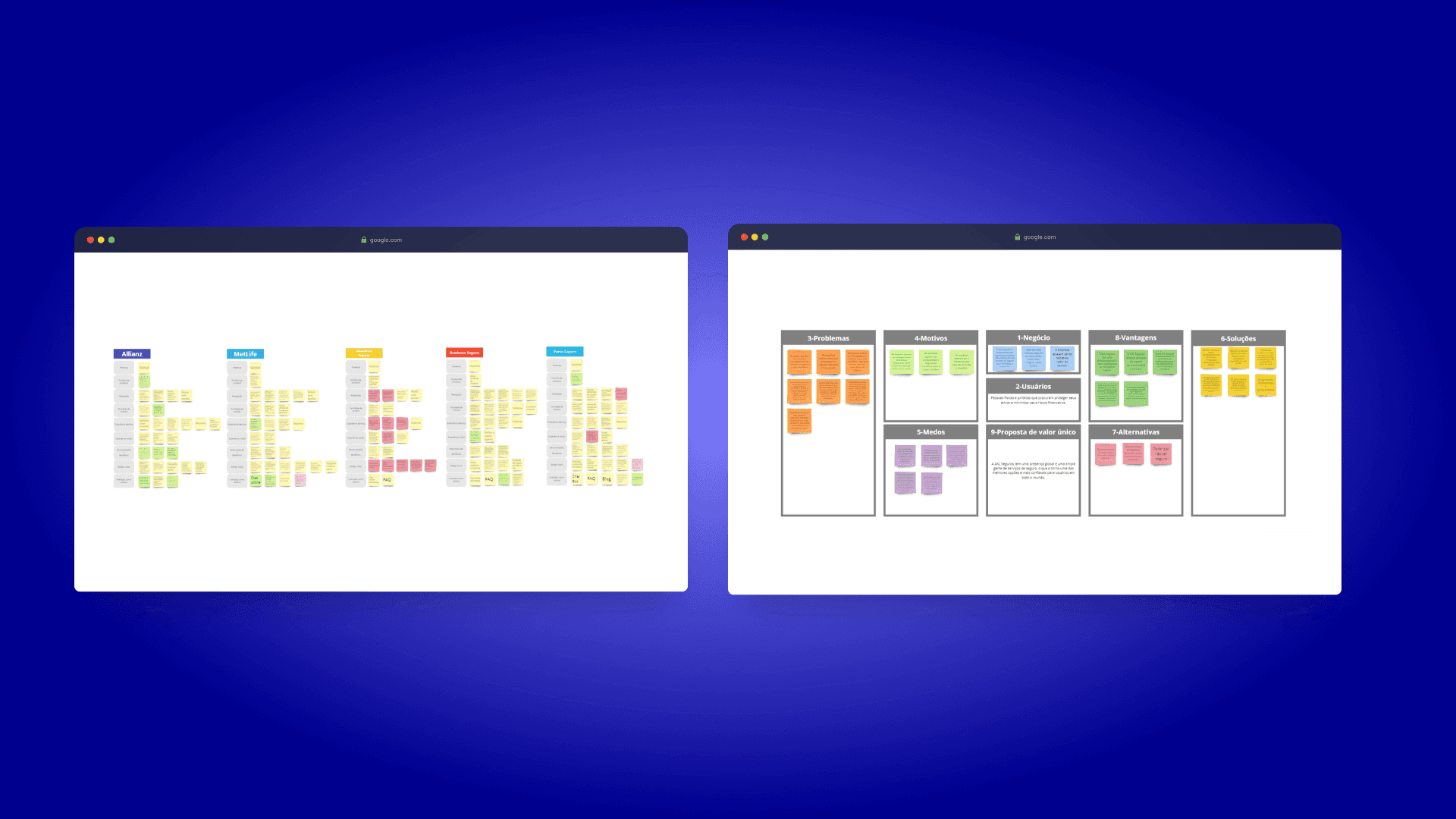
Starting this project, I organized a user-centred canvas to highlight and structure important information.
Next, I analyzed 5 competitors of AXL, including both national and global, direct and indirect competitors, thus allowing for the identification of how other players are behaving and positioned, as well as verifying positive and negative points.
This process is also important to gain insights into positive points right at the beginning of the project.
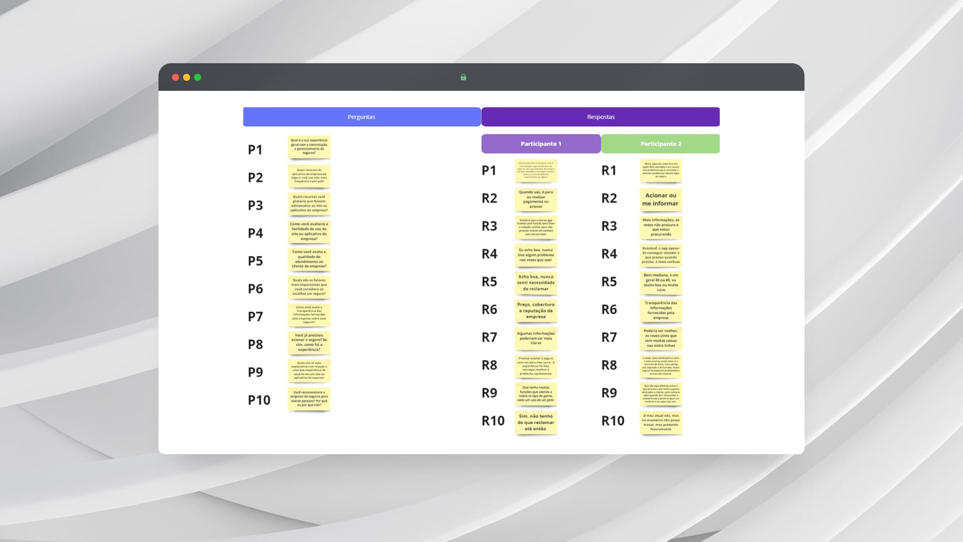
Understanding users
To deeply understand users' needs, I implemented a three-phase research approach:
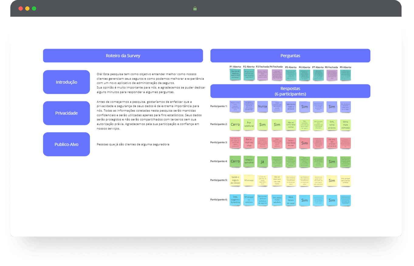
1. Online survey
2. In-depth interviews (in-person and online)
3. Usability testing for practical evaluation of the interface
This methodology allowed me to identify pain points and opportunities, underpinning the development of user-centered solutions.
Most desired functionalities
Real-time assistance
Interaction with consultants
Bill payment
Insurance customization
User expectations
Multiple functions
Clear and transparent information
Consistent customer service
Ease of use
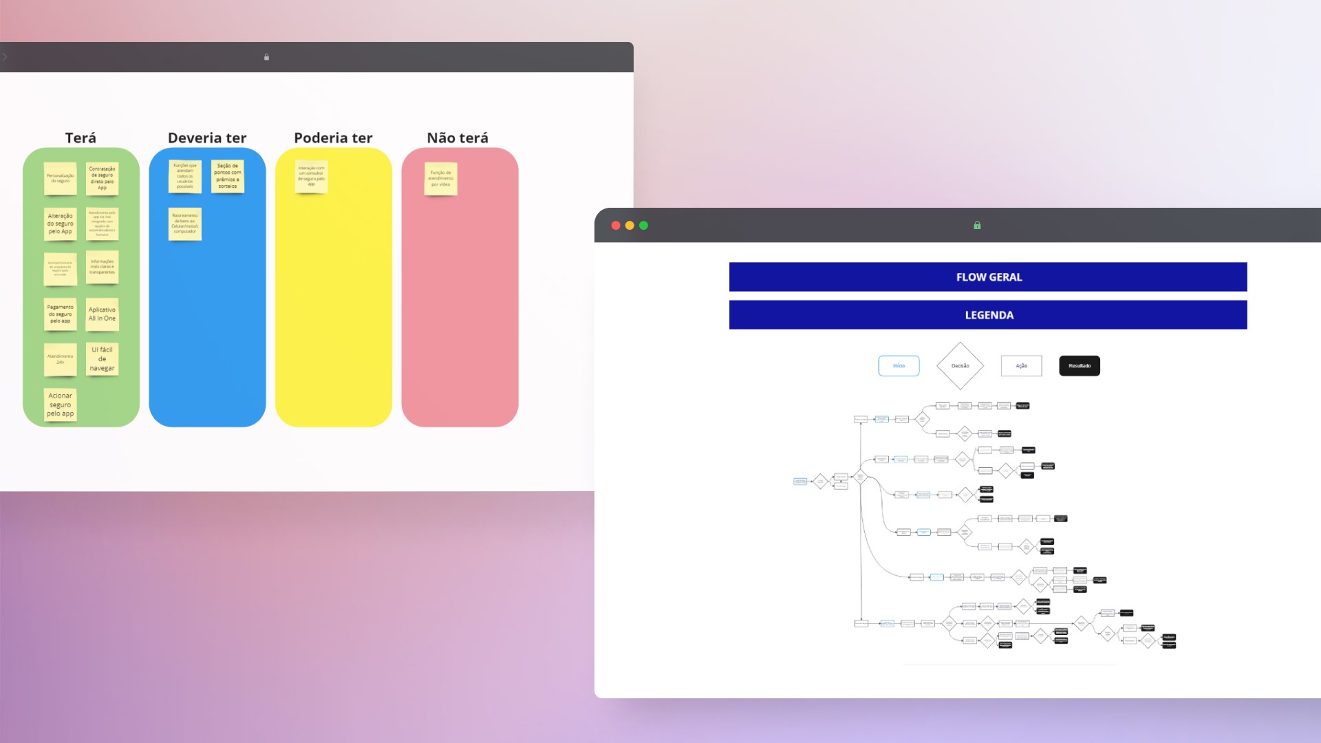
Strategic Prioritization and Navigation Definition for Product Alignment
I used the MoSCoW technique to prioritize the functionalities and features that the product will or will not have.
This approach was fundamental in aligning the team's expectations and ensuring that the most critical resources were prioritized, guaranteeing that the project meets the essential needs of users within the established deadlines.
Next, I developed the product's information architecture through a "User Flow", establishing the entire navigation structure.
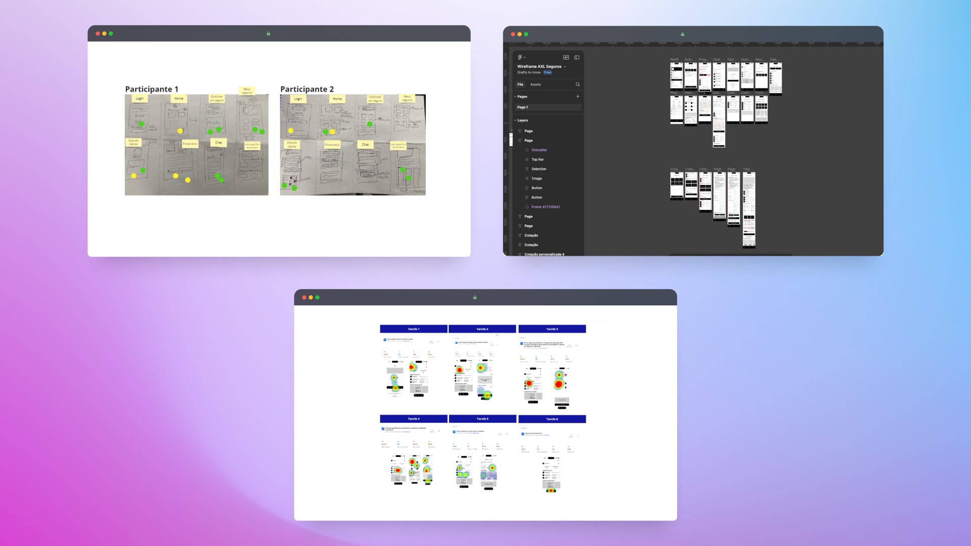
Creative Exploration and Feature Validation for Product Optimization
I conducted a Crazy 8's exercise with two participants to generate ideas quickly and explore new features for the application, expanding the possibilities that could have been overlooked.
After the exercise, the participants carried out a dot voting to select the best solutions.
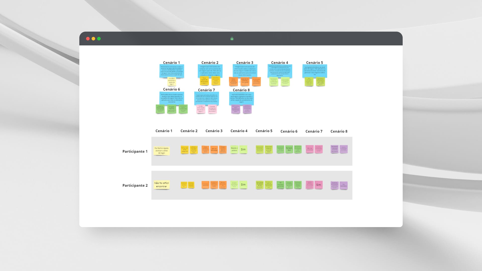
Additionally, I conducted usability tests on wireframes to evaluate user interaction with the proposals. This allowed us to identify and eliminate features that did not meet expectations, ensuring that only the most effective characteristics were integrated into the final project.

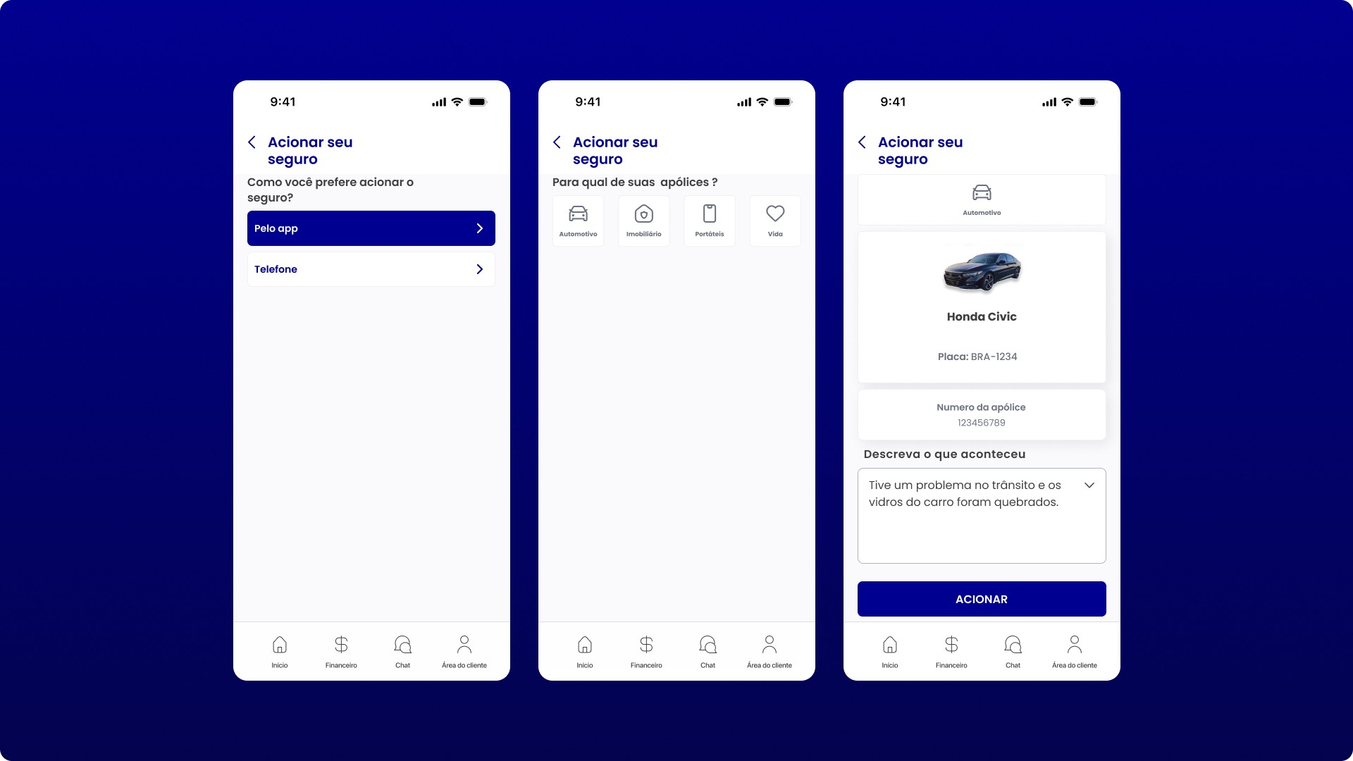
Acionar seguro em qualquer hora e qualquer lugar

Atualize ou altere sua apólice de forma simples
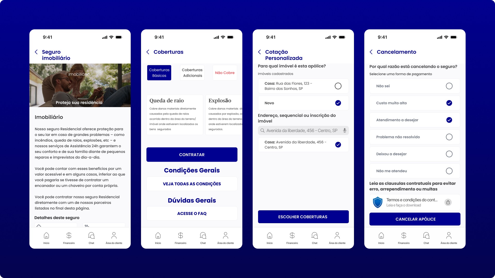
Contrate e cancele a qualquer momento
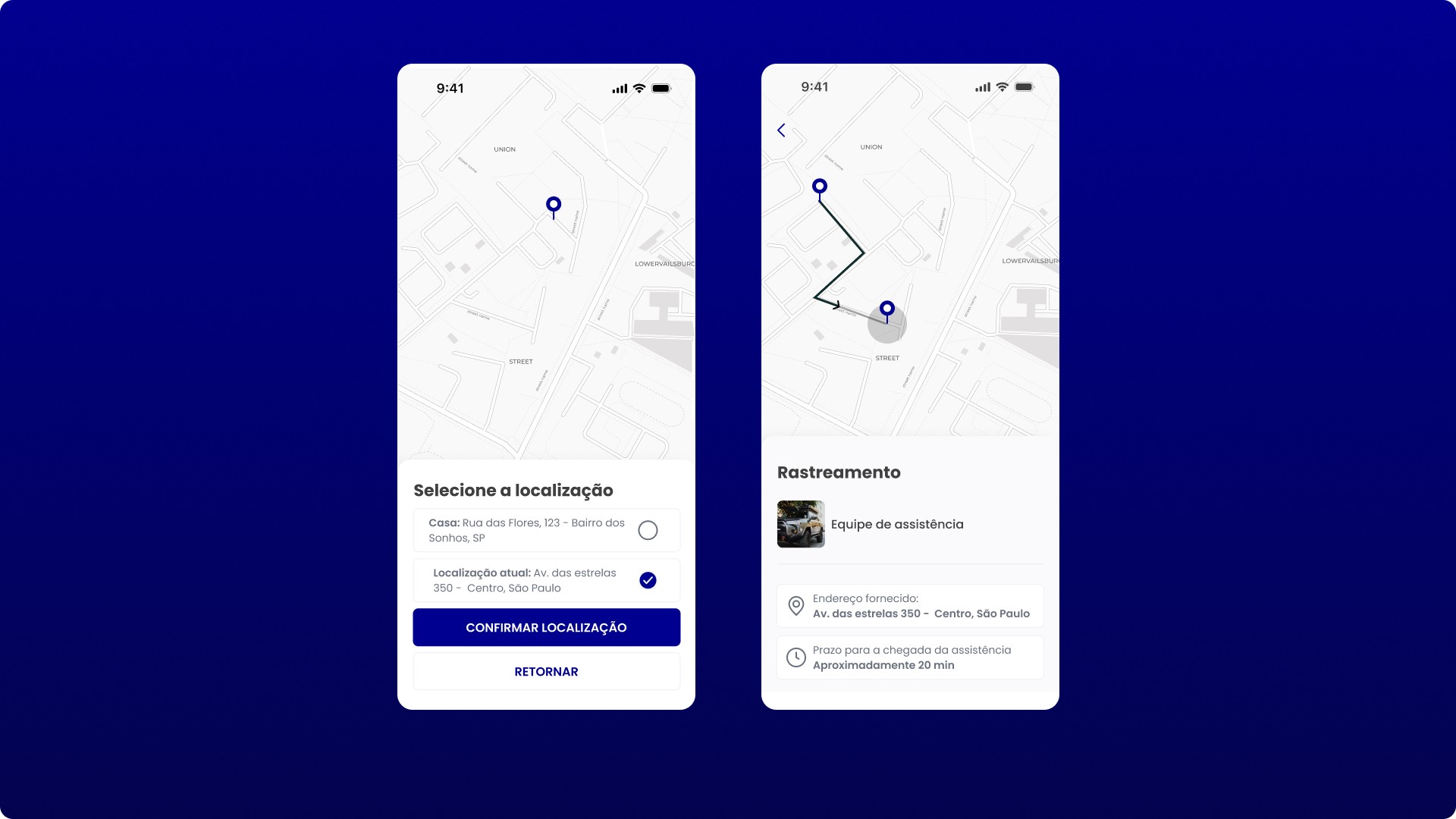
Assistência 24h
In retrospect
The initial problem involving the need for several different applications to manage insurance has been resolved.
Furthermore, along the way, other features were implemented based on pain points and opportunities I found while generating insights for additional functions that users would like to see integrated into the final project.
Others
Projects