
Decolar
UX/UI
Case study
Problems
Despegar is an online platform for selling tickets, accommodations, packages, and vehicle rentals, where the customer can plan their entire trip in one place.
However, it doesn’t take long to notice issues with its usability; users have difficulty finding what they want due to the excess information displayed, which results in lower conversions.
Additionally, there is a considerable problem with travel packages, where the current conversion rate is low.
Objective
Reduce user friction with the platform, simplify how information is presented so that they can find what they are looking for as quickly as possible, and provide a personalized experience for customers.
In this way, it will be possible to increase both conversion and user retention on the platform.
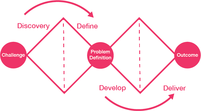
Process
Double Diamond
Initial research
Decolar is one of the leading online travel agencies in Latin America, highlighting its role in the Brazilian market and the need to improve user experience in a competitive environment.
Main OTA (Online Travel Agency) in Latin America, focusing on air tickets, hotels, and packages.
Increased demand for online platforms to purchase tickets due to:
Convenience, Speed, Accessibility
60% of the revenue of the Despegar group (US$ 424 million in 2023).
The company has invested in technology, such as artificial intelligence and machine learning, to personalize experiences and increase conversions, with tools like the virtual assistant Sofia.
How the competitors are dealing
In the travel sector, each competitor adopts its own strategy to stand out:
CVC: Trust through physical presence and exclusive packages.
123 Milhas: Promotions and flexibility.
Kayak: Modern visuals and experience with various functions that operate independently as a meta-search engine, even being part of the same group as Booking.com.
Expedia: Offers an integrated shopping experience, with packages, insurance and support.
,
Google Flights: Utilizes advanced technology with predictive algorithms and dynamic filters.

Understanding users and their needs
I organized a Survey aimed at understanding the needs, preferences, and difficulties of users when buying airline tickets online.
Next, I created a Jobs To Be Done, which aligns products and services with the real needs of users, ensuring that they solve their problems efficiently and satisfactorily.


Survey results
There is a lack of clarity and transparency, which is one of the cited demands, the need to clearly show all fees at the beginning of the process.
Major complaints include
surprise fees at the end of the process, advertisements hindering navigation, and issues with refunds and cancellations.
Users report difficulties in finding information and alternatives, as well as a slow performance of the pages.
There is a need to clearly show all fees at the beginning of the process
Prioritizing in a sea of information
To start the process, I explored opportunities through the How Might We methodology.
Next, I prioritized ideas based on impact and technical feasibility, using a 2x2 matrix, and organized the initiatives with the Now, Next, Later approach, ensuring focus on immediate actions, strategic planning, and long-term innovations.

Understanding priorities and formulating hypotheses
To structure a more effective navigation, I conducted a Card Sorting with users who frequently buy tickets online to identify how they organize and prioritize information.
These insights formed hypotheses aimed at improving the experience, focusing on clarity, personalization, and smart filters.
The goal was to align the solution with the real needs of the users, ensuring a smoother, more efficient, and satisfying journey.

How can we solve this problem?
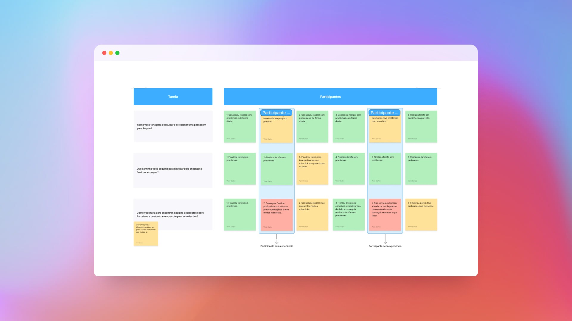
To conclude the mapping of the user journey, I conducted a usability test with one participant, during which I recorded detailed observations about their impressions and interactions with the system.
To ensure visual consistency, I developed a Moodboard that guided the design decisions and served as a creative reference throughout the project.
I finalized with usability tests on the wireframes, applied to six participants. The feedback was essential to adjust the solution before moving on to the final design.


Main problems identified in the test
The search form had the highest number of usability issues.
Some non-interactive elements did not receive clicks due to lack of clarity.
The participant got confused with the "Discover" feature and ended up giving up.
Issues with misclicks on the "Hire new insurance" screen.
Suggestions for Improvement
Improve guidance within the "Discover" feature, such as adding instructions or visual tips.
Strengthen visual feedback and the hierarchy of information.
Facilitate navigation to customized packages.
Optimize the search form to eliminate friction points and ensure greater efficiency in the user journey.
The new interface


Formulário de pesquisa

Resultados da pesquisa

Monte seu pacote

Descubra destinos
Validating Features
Assessing the effectiveness of the interface and identifying opportunities for improvement.
I conducted a usability test with the aim of identifying problems and validating whether the product meets the needs of different user profiles.
To do this, I selected participants with varying levels of experience in online travel purchases, from beginners to advanced users.
The analysis revealed important points to enhance navigation and clarity of the interface.
Main problems identified in the test
5 out of 6 users were able to complete all the proposed tasks
Lack of clarity in some elements caused click errors (missclicks)
Beginner users faced more difficulties than experienced ones.
The "Build Your Package" flow presented the highest number of issues.
A/B Test – Evaluation of the "Build Your Package" Flow
After identifying that the “Build Your Package” feature was the most problematic in the usability test, especially among inexperienced users, I conducted an A/B test with 5 participants.
The objective was to compare the current version of the interface (Variant A) with a revised version (Variant B), seeking to understand which one provides a better experience in the flow.


Test results
Variant B had better overall performance, with 100% task completion within the expected time, compared to variant A which had a 40% completion rate.
The only downside of Variant B was missclicks in 20% of a participant's interactions, but this did not prevent the completion of the task.
Variant B had 60% more success in task completion compared to Variant A (100% vs. 40%).
At the end of the test, the tested interface was considered functional.
In retrospect
The project was enriching for my learning; I was able to refine my skills in various areas of design.
Moreover, this project taught me that good design decisions arise from active listening to users combined with collaboration across areas.
Others
Projects
AXL Seguros