AdotaPet
UI
Case study
Duration
Start:
May 2024
End:
July 2024
Skills
Ui
Author
Yann Carlos
Problem
"Although there are more than 100 million dogs and cats in Brazilian households, a number higher than that of children, many of these animals are still in shelters or on the streets, having gone through a lot of suffering."
Objective
The initiative aims to develop an online digital platform dedicated to the adoption and delivery of animals in need. With an intuitive interface, the project's main objective is to facilitate the adoption process by efficiently connecting adopters to animals that need a new home.
Drawing inspiration from what already works
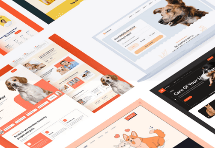
I started the project with a comparative analysis of websites with similar proposals, identifying their strengths and weaknesses to incorporate the best practices available into AdotaPet.
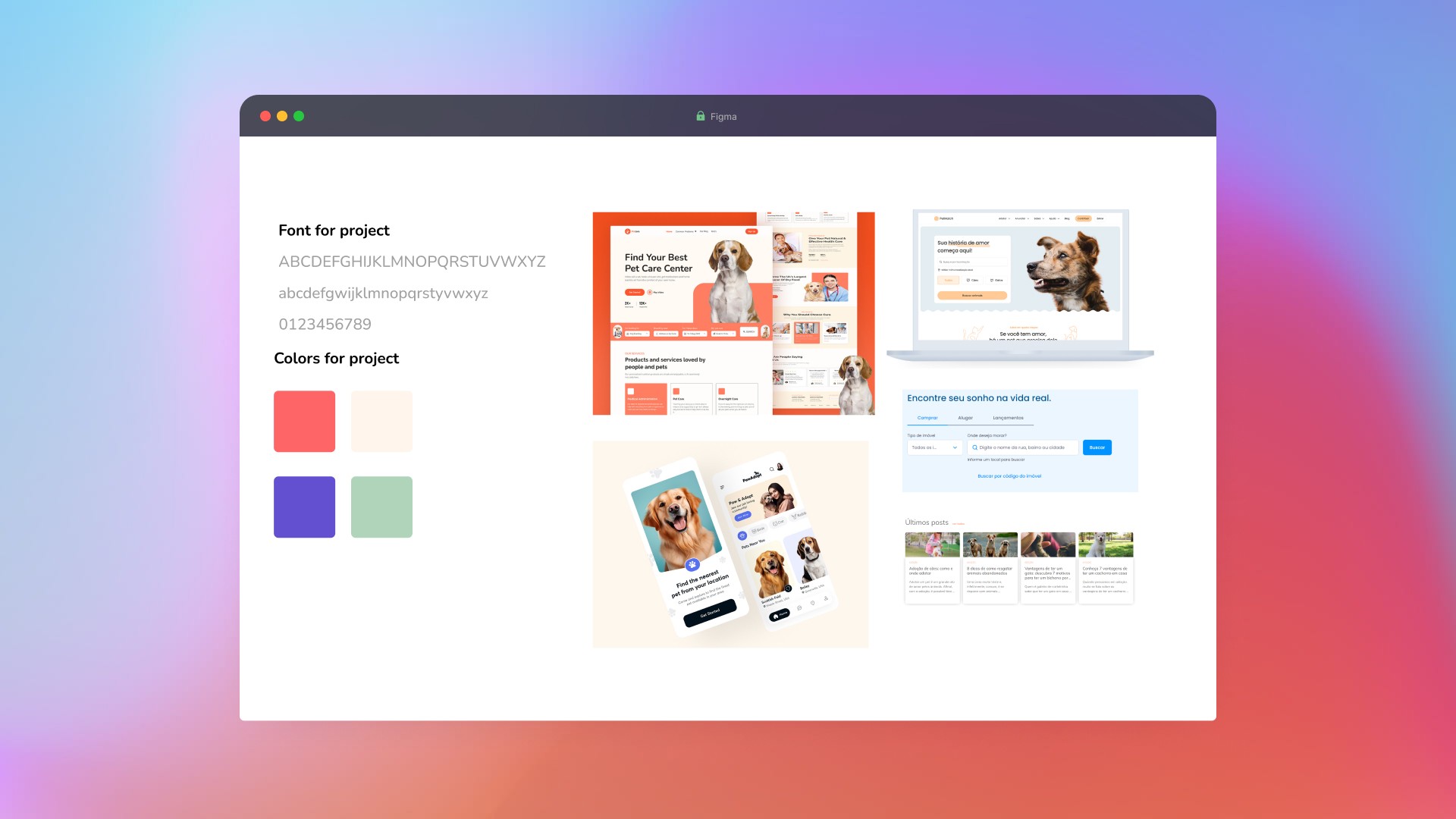
Next, I developed a moodboard to explore the most suitable fonts and color palettes for the project, as well as gathering inspirations that I identified as the best.

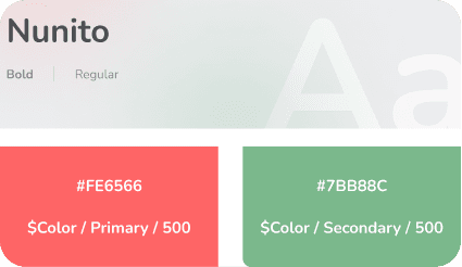
Setting color palette and typography
Defined the primary, secondary, destructive, attention, and confirmation colors;
Regarding typography, the rounded and friendly design of the font conveys a welcoming, modern, and clean appearance.
Design tokens for both are added to the documentation for handoff so the developer will have as little friction as possible.
Responsive Design Planning and Navigation Architecture
The project briefing specified that the site, although focused on the desktop version, should also have a mobile version. With this in mind, I developed grids for each breakpoint for the AdotaPet project.
Creating the site map was an essential step in defining the necessary pages and organising navigation before starting the interface design.
From Sketch to Detail
Low-Fidelity Wireframe:
At the beginning of the interface construction, I develop the low-fidelity wireframe, allowing me to explore functionalities, solutions, and the information structure in an abstract way.
High-Fidelity Wireframe:
At this stage, I start increasing the fidelity, checking if the structure makes sense according to the addition of texts and the draft of the components.
Ui Design
Desktop version
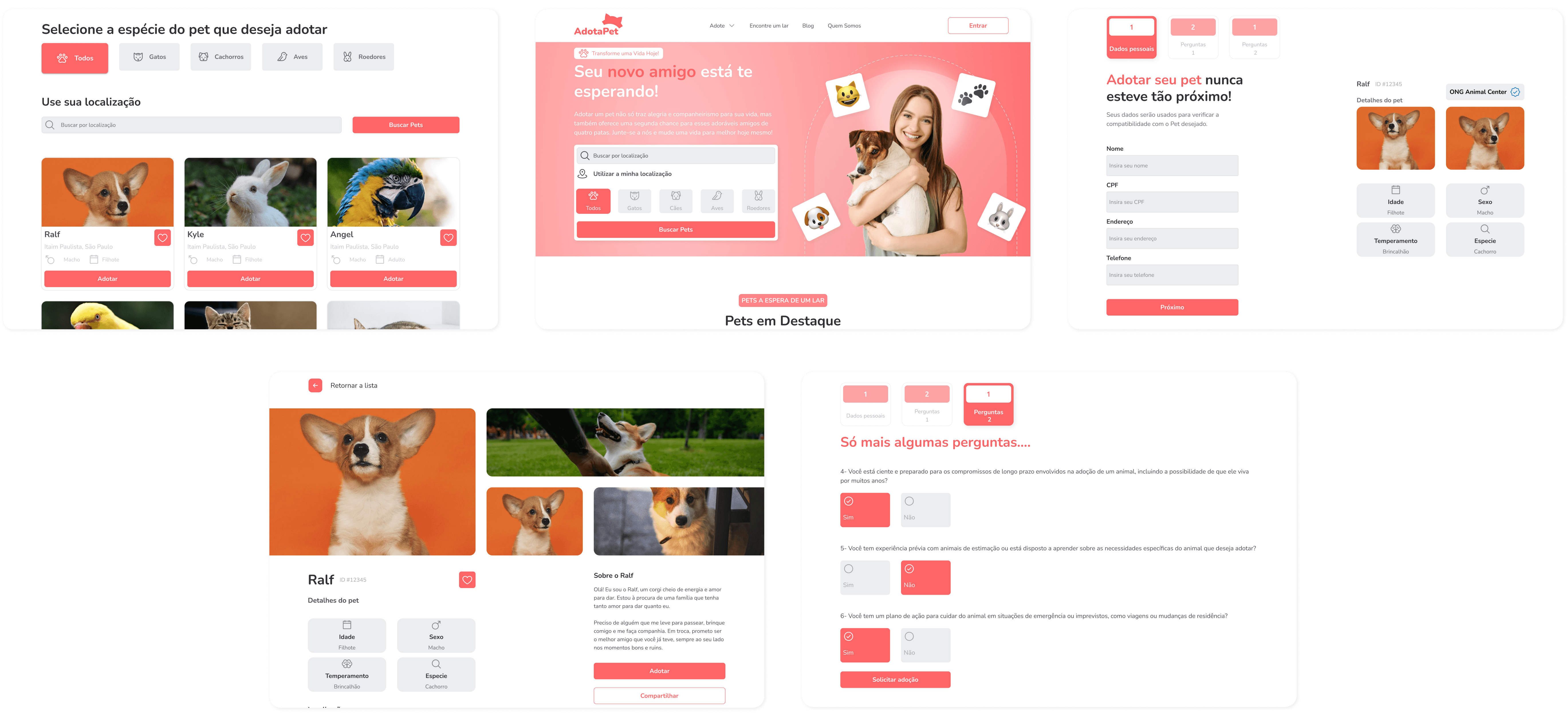
Starting with the desktop version, I added colours, icons, images, final texts, and the finalized components.

Mobile version
To optimize the interface, I made adjustments to the layout, such as reorganizing menus and simplifying complex components.
Elements like buttons, texts, and images have been resized and realigned to provide an experience for smaller screens.
In retrospect
This project provided a valuable opportunity to explore in depth the various aspects of interface development. Through a methodological approach.
The process involved a series of iterative steps and continuous refinement, resulting in a robust solution.
The developed interface not only meets the functional needs of the project but also contributes to the social mission of facilitating the adoption of animals and adopters.
What I learned
Processes:
Following each process, and understanding the importance of each one and how they complement each other until reaching the final result was of utmost importance to achieve the outcome.
Documentation:
In this project, I had the opportunity to interact with design tokens, and part of the documentation process, how they work and help in the communication between designer and developer at the time of handoff.
Technical skills:
During this project, I had the opportunity to develop and refine several essential technical skills, specifically in Figma, which allowed me to explore in-depth features that I had not experienced before.
Axl Seguros
Ideation of a new experience in an All In One app for Axl Seguros.
Decolar
Simplifying the Online Travel Shopping Experience


